KEMET Brand Guide
KEMET plays a key role in building a connected, mobile, and sustainable world. Our products are critical to the fastest growing sectors today and our solutions will enable the future.
Overview
Why have guidelines?
The purpose of this document is to ensure consistent communication of the KEMET brand identity through all channels and external parties. We have an enterprise-wide commitment to the importance of a strong brand and the discipline of managing a consistent, high quality brand identity.
These guidelines are to be used by anyone producing communications for and on behalf of KEMET, including:
- employees
- partners
- design agencies
- freelance designers
- merchandise companies
- exhibition stand designers and builders
- distributors
- contractors
- event management vendors
“Built into Tomorrow” positions KEMET as:
- Innovators and leaders creating solutions that will be essential to the future of technology.
- Engineering experts and creative thinkers who are collaborating with the world’s most innovative companies to turn visions into reality.
- Experts in technology and material sciences that will lead to a new future that engineers can only dream of.
Guidelines ensure consistency among different mediums.
Brand Guidelines
KEMET Logo
Only KEMET and authorized/approved users may use the KEMET logo.
Best Practices
Positioning: The KEMET logo preferred use is on a white background with an exclusion zone around it.
- Always use this logo in its entirety. It should never be created from scratch or manipulated in any way.
- When the KEMET logo is required and the background color is KEMET Blue or another very dark color, please use the logo in the reverse, all white version.
- Minimum logo size is 25.4 mm (1 in.) wide.
- The logo should not be used in place of the name within body copy/editorial content.
- The logo should not be used in place of the name in any scenario where the logo might be used as a lead-in or follow-up, such as “KEMET presents” or “by KEMET” or “KEMET Approved Vendor,” etc.
Joint Branding
Where the KEMET logo is being used in conjunction with another logo on a page, the KEMET logo must be at least the same size as the accompanying logo(s). It must never be smaller. The two logos must never be shown directly side by side or on top of one another.
Avoid
- don’t use old/older versions of logo
- don’t crop the logo
- don’t distort the logo
- don’t rotate or flip the logo
- don’t obscure the logo
- don’t change the corporate colors from those stated
- don’t place the logo on a visually cluttered or patterned background
- don’t use logo artwork that has been rendered to look three-dimensional or animate the logo
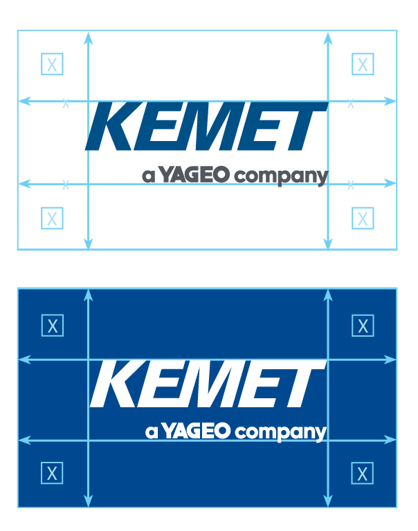
The exclusion zone must be equivalent to the height of the logo on all 4 sides and applies to the KEMET primary and alternate logos.
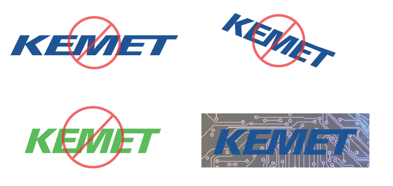
Using the KEMET logo in the ways shown in this visual among others is prohibited.
KEMET alternative logo
Alternate logo
Variation of our main logo, with tagline and circuitry.
If possible and within size constraints, please use the alternative logo, but primary is acceptable: PowerPoint slides, website, print work, email signatures, social media.
Typefaces
Red Hat is our primary font used for both web and print. The Red Hat type family is produced in two optical sizes, in a range of weights with italics.
The Display styles, made for headlines and big statements, are low contrast and spaced tightly.
The Text styles have a slightly smaller and narrower width for better legibility, are spaced more generously, and have thinned joins for better performance at small sizes.
The two families can be used together seamlessly at a range of sizes.
Type color
Headlines or Subheads use KEMET blue:
- Pantone 280C
- CMYK: 100, 72, 0, 18
- RGB: 41, 61, 139
- HEX: 293D82
100% Black text used for general body text. White text is used when over a dark background or photo.
You may download the Red Hat font here.
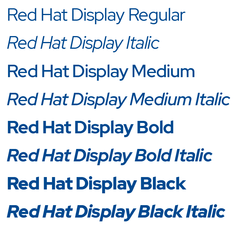
Red Hat Display
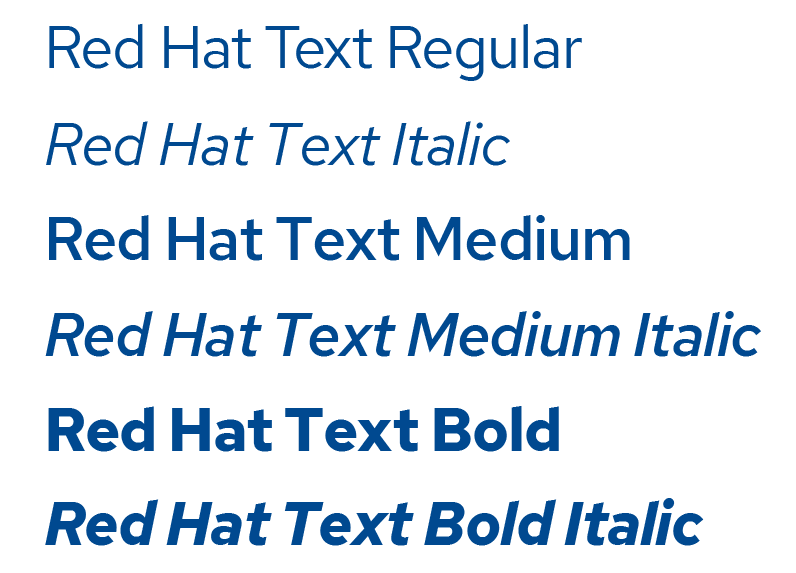
Red Hat Text
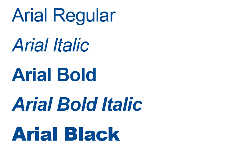
Arial
When Red Hat fonts are not available, use Arial instead. Arial is our in-house alternative to Red Hat.
Brand Colors
The KEMET primary color palette is used for all communications. Print, internal documents, electronic or web. The primary color palette is the foundation of our brand.
- KEMET Blue is used in our logo, and is utilized throughout our branding.
- When choosing main background colors, use a balance of color and white space (to help keep designs clean and readable for everyone).
Our Secondary color palette is in the same tonal range as our primary color palette and can be used as additional accents or in conjunction with our primary color palette. Using the secondary color palette is a good way to keep our brand looking fresh and communicates that there is something new or interesting to see. It should still feel like KEMET and bring the same energy. Usage includes: product launches, special promotional campaigns, social media, print or web communications.
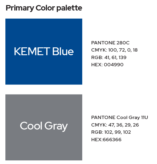
Primary color palette
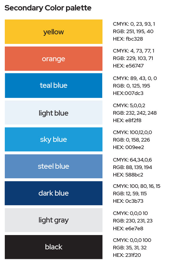
Secondary color palette
Image Guidelines
Images are protected by international copyright laws. As a brand, we may only
use images the following types of images:
- Images that we ourselves have taken
- Images taken by individuals who have granted us permission to use them
- Images that are copyright-free and in the public domain
- Images for which we have purchased a commercial license
In each case, we need to know the origin of the image, and we need to ensure that we have the appropriate permissions on file. There are strict repercussions for violating copyright, including hefty fines.
KEMET’s Style
KEMET uses a variety of images. In general, KEMET photos are plain, clear, and without stylized filters or effects.
Images depicting emergent technologies are conceptual or abstract. Those depicting current technologies are realistic. Examples include alternative energy, medical, defense, or automotive.
When depicting a lifestyle or people, when possible use KEMET employees and/or engineers. Our pictures need to reflect our customers, which include people who are in high tech labs and well as casual, informal engineering spaces and labs.
Make every effort to showcase the diversity and inclusion of KEMET with real photos as well as stock photography. This includes diversity of age, race, nationality, gender, and physical ability. Our images need to reflect the makeup of our company and our customers.
We brand by uplifting KEMET and not by bringing down our competitors. As such, use only KEMET branding in your images, and do not use competitors’ brands. In cases of partnerships, or co-branding (with an organization or a customer, for example), always get permission from both the partner brand and KEMET before releasing any co-branded material. The final piece will need to be approved by all parties involved.
Best Practices:
- Choose a focal point. Do not use multiple, competing photos in the same space.
- Choose a theme. If you are using abstract photos, continue with that theme for consistency.
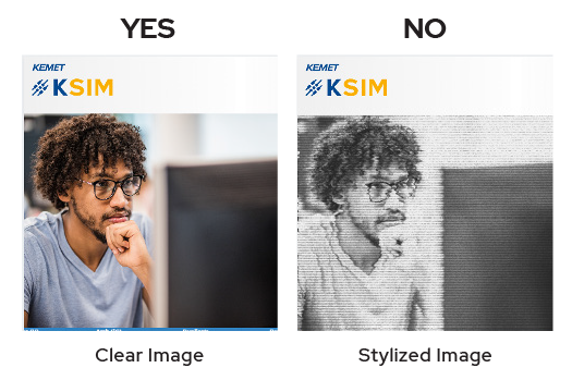
Clear vs Stylized Image
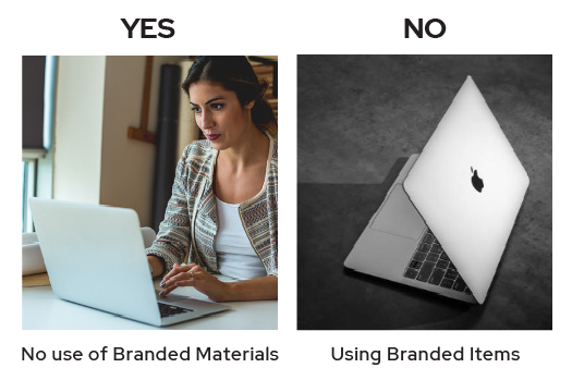
No use of branded materials
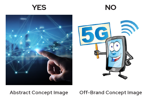
Abstract Concept Example Image
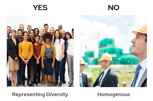
Image representing diversity
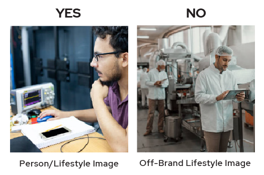
Person/Lifestyle Image Example
Video Guidelines
KEMET follows best practices when it comes to video production. If making a video, please consider the following:
- Quality should be consistent and professional
- Products & branding, including logos, colors, and taglines should be up to date.
- Videos should be easy to understand and not longer than needed
- Videos should tell a story or adds to the experience
- As with images, please try to reflect the diversity of KEMET customers and employees.
For reference, please visit KEMET’s YouTube or Dacast channel, where available.
Note: As with the photo guidelines above, many of these could be positioned as “should” rather than “must” to allow for some flexibility.
Video Guidelines
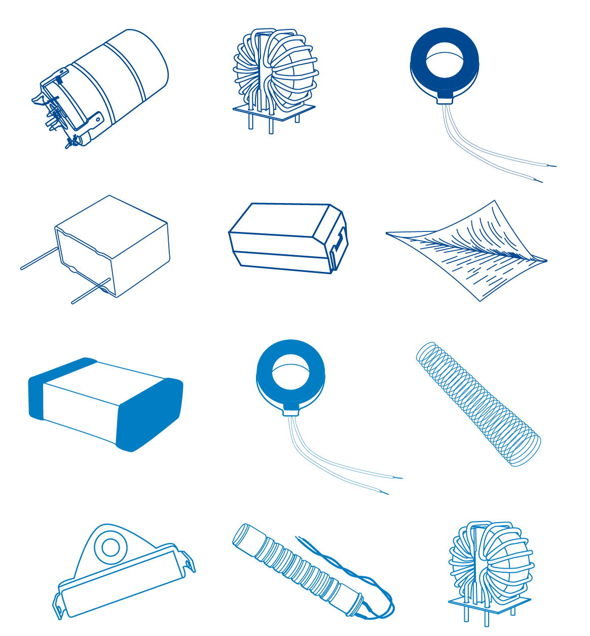
Product Photography
KEMET provides a wide variety of high quality product photos. Every aspect of KEMET product photography, from framing and composition to lighting and camera angle, is carefully controlled by KEMET. Use only current product photo assets designated for use by KEMET.
Don't
- place a KEMET product image on a busy, colorful, textured, or patterned background
- alter KEMET product photos or add type or other graphics
- animate or enhance KEMET product photos
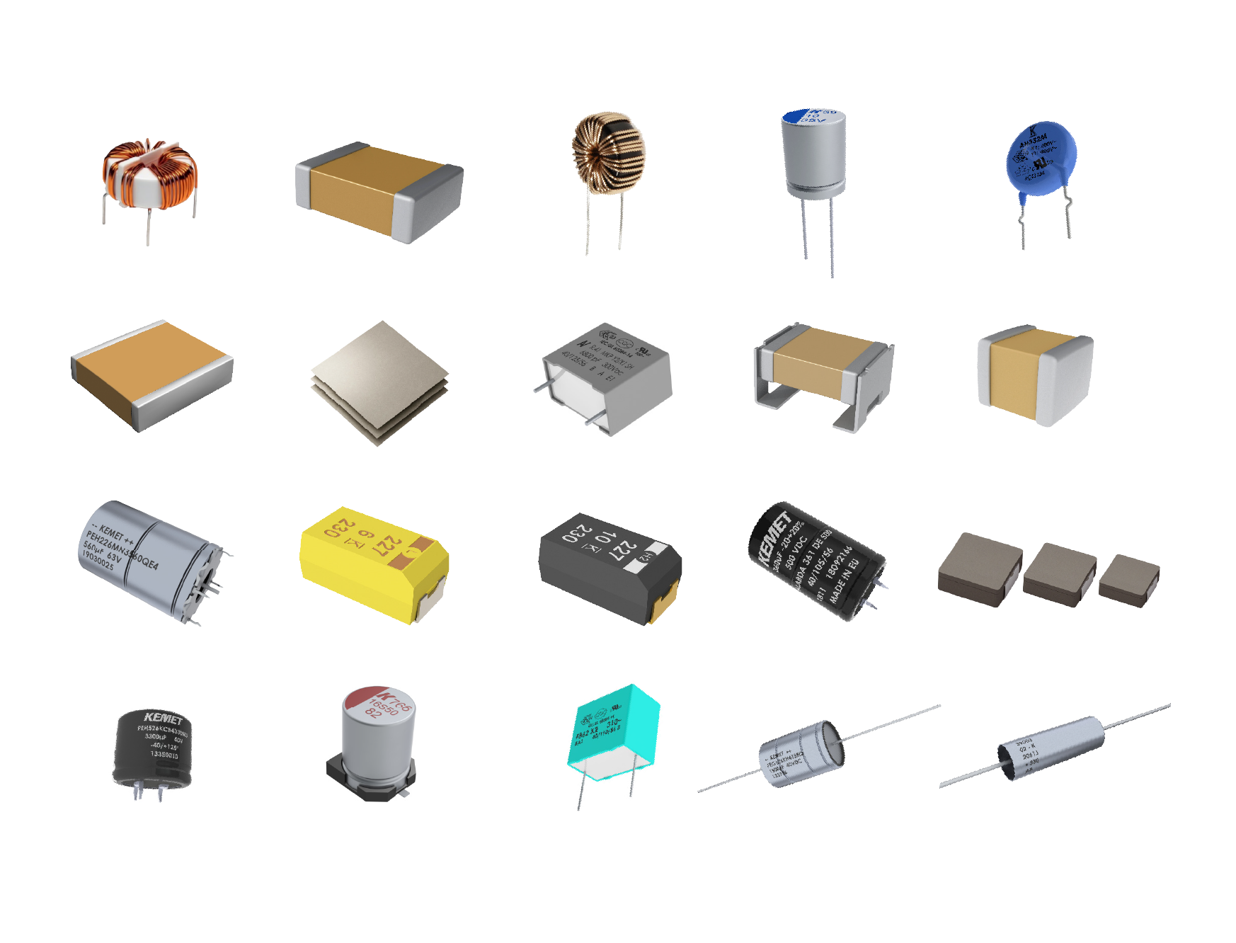
Product Photography
Iconography
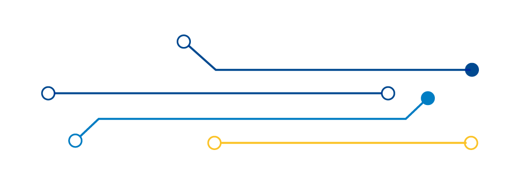
Circuitry
KEMET uses circuitry as visual elements to enhance branded content. These elements must be approved and/or created by Branding & Communications.
Specifications:
- KEMET primary color palette.
- Evenly spaced lines with an open circle or closed circle on the start/end.
- Minimal use of circuitry, industry, applications and product icons, should be used for PowerPoint and social media.
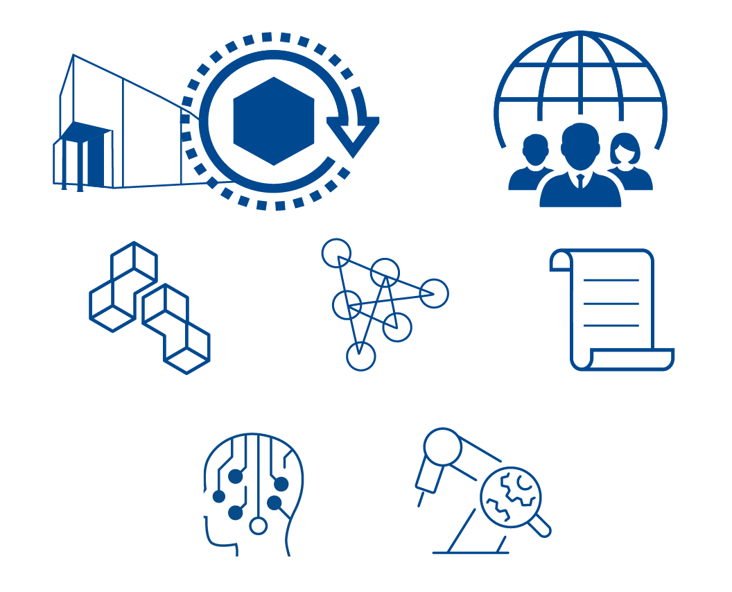
Product Illustrations
Product icons are used as a visual expression of our brand and products. They are visually distinct and unified with color, weight and consistency.
Icons
KEMET uses a unified icon library.
Circuitry
Icons
Line Drawings
Branded Promotional Items
You are welcome to use the KEMET logo on promotional items, in accordance with brand guidelines. Please use the KEMET logo, without additional words or circuitry on all embroidered items, like polos and hats.
Silk screened or printed items may use the KEMET logo with circuitry. Please adhere to the color guidelines above. Please contact the Office of Branding and Communications at communications@kemet.com if you would like to use the logo differently on branded promo items.
Embroidery
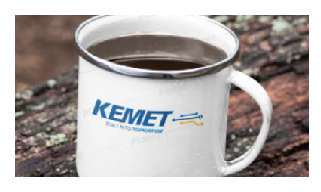
Printed Logo on Items
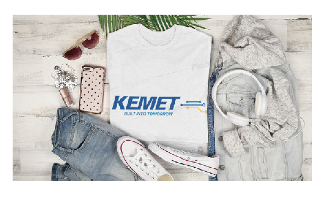
Branded Shirt
Social Presence
Social Media Usage for KEMET Employees
KEMET encourages the professional use of social media for employees in order build a network of contacts, increase brand visibility, and engage with customers and business prospects.
While employees can use social media in a professional capacity during work and non-work hours, they still must adhere to the KEMET Global Employment Policies regarding posting on external (public) social networks such as, but not limited to, Facebook, Twitter, and LinkedIn. Please read and familiarize yourself with our policies under the “Electronic Information Systems” section in the Global Employment Policies document linked above.
Employees who post publicly about KEMET are henceforth associated with the KEMET brand. Therefore, you must audit and monitor your personal usage of your social media accounts. Audit what you’ve personally posted or shared in the past and monitor what you post or share going forward. Any of your posts that are set to public viewing without privacy restrictions must fall under the values and ethics set forth in the Global Code of Conduct document. Please read and familiarize yourself with our values and ethics in the document linked above.
Before Posting
- Use good judgment and awareness in what you’re posting and its permanency on the internet. Check and test your privacy settings for your social media accounts and posts.
- Make sure your posts are consistent with KEMET’s social media branding, editorial style, and tone.
- Do not include any internal KEMET information within a post or statement for an external (public) forum or social network unless the information has been officially approved for public release by the Senior Vice President of Human Resources, Corporate Communications and/or General Counsel. See Electronic Information Systems policies for more details.
- Respect copyright rules for any external content you include in your posts. Properly credit the sources of the material and/or information you use.
- Check and re-check for correct spelling and grammar in your posts.
- Test the links in your posts to make sure they are working and directing to the correct source.
- Tag our accounts in same social network you’re using to post. For instance, if you’re posting on Facebook, tag KEMET’s Facebook page in your post.
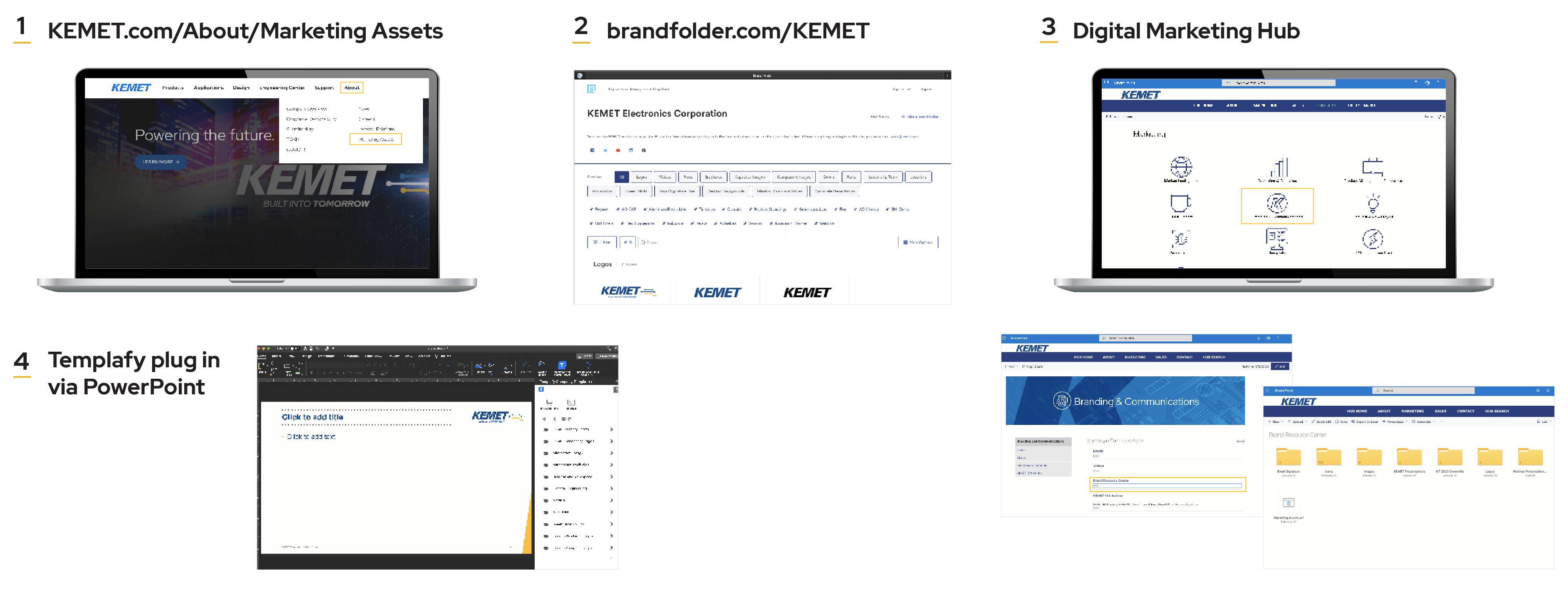
- When in doubt about the content of your posts or if a KEMET.com link is broken, consult with the Branding & Communications team first. Email us at communications@kemet.com.
After Posting
- Check your posts for any interactions and comments
- Reply to people who engage with your posts. Be polite, helpful, and use appropriate language when engaging with others on social media.
- If you happen to be approached by a member of the media to comment or if you’re unsure about answering someone’s question, do not comment. * Instead, contact the Branding and Communications team immediately at communications@kemet.com for guidance.
* Note that anything you publish must be true and not misleading, and all claims must be substantiated and approved.
General Social Media Guidelines
The KEMET brand must be protected while being used over social media. We adhere to the branding and image guidelines as outlined above, with few exceptions. If you are in doubt, please contact the Office
of Branding and Communications at communications@kemet.com for advice.
Colors
If using KEMET-branded materials, please stick with approved colors mentioned above.
Memes
Please try to avoid the use of KEMET branded materials in memes.
Hashtags
Hashtags are ever-evolving and need to be continually monitored. Please use hashtags carefully. You should check to see what else is posted on your hashtag before associating KEMET content with it.
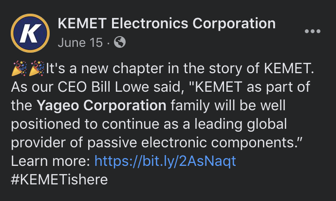
KEMET branded hashtags include #KEMETishere, #BuiltIntoTomorrow, and #KEMETCares. Please do NOT use controversial hashtags, political hashtags, hashtags that are branded by other corporations, or hashtags that indicate location, i.e. #fortlauderdale.
Imagery
In addition to the guidelines, above, certain social channels or social media events & holidays can call for more playful images. Use such images in good taste and with good judgment.
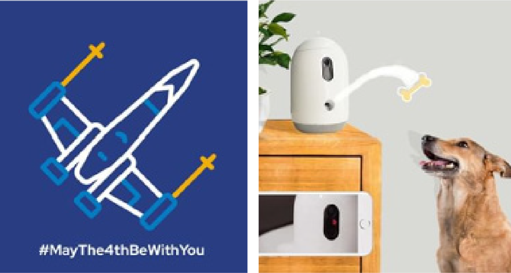
Examples of the type of images appropriate for social media usage.
Social Text: KISS
When it comes to social text, keep it short and snappy. To formulate a good social message, hook the audience with the first few words, get right to the point, include a call to action, and finish it off with relevant & vetted hashtags.
Some people and brands use Instagram as a mini-blogging platform, and that is fine, but be sure to start with a strong hook and end with a clear call to action, even on longer posts.
Avoid political or controversial topics. Join the conversation about neutral or fun topics, but take care to avoid divisive topics. Do not attempt to represent KEMET’s viewpoint on something, and realize that you may be perceived that way, even if you are trying to represent your personal point of view.
Mini-Blog
Emojis are A-OK! But keep it professional and on brand. Please be aware that some emojis have underground meanings, so look at what other brands are doing before using an unfamiliar emoji. If representing KEMET, avoid specific skin tones with emojis & use the cartoonish yellow.
Emoji Usage
When representing social media icons/badges in materials, use the standard color icons as provided by the platform. These can be found in the branding section of the platform’s website.
If the icons appear in a row, keep the icons similarly sized and neatly/evenly spaced. If you’d like, you may use the black and white version of each logo for uniformity.
Social Icons
Brand Guidelines for the Web
The goal of these guidelines is brand unification and consistency across digital KEMET properties. Combining classic principles of good design with the innovation and possibility of technology and science, these visual and structural best practices support a unified user experience across platforms, devices, and input methods. Be sure to familiarize yourself with these guidelines prior to beginning a new KEMET web project.
The information in these guidelines is intended to be as up to date and complete as possible. However, this is a living document that will be added to and modified to allow for adaptability as modern web practices change. Any scenario not directly covered should be developed with appropriate approvals to be consistent with and complementary to these guidelines.
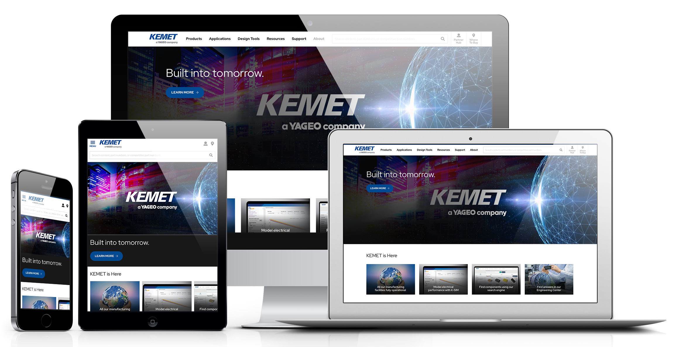
KEMETs digital properties are available on multiple devices.
Building Blocks
These basic visual elements, including colors, grid treatments and typography, represent the smallest, most general and most reusable parts of the interface. To help maintain a unified appearance and brand experience, make sure you are using them correctly and consistently in your designs.
Color
KEMET has three primary colors to represent its brand, all of which appear in the official KEMET logo. They are emphasized across KEMET mediums, and they should be leveraged heavily on the web as well. Note that the specific version of the palette shown here has been optimized for the digital space.
The primary colors should be used often to reinforce the brand, but secondary or “theme” colors allow for more flexibility and freshness when designing for the web. This gives you leeway as a developer, but try not to stray too far from the main brand colors. A good rule of thumb is to choose a primary color and build a theme that incorporates secondary colors of that same hue but different tints or shades, as opposed to introducing an
all-new color.
For contrast and accessibility, all colors and combinations of colors should be AA compliant.

Primary HEX: 293D82

Secondary HEX: 718096
KEMET also employs a limited selection of colors used to highlight specific “states” or situations, as shown. These states include “info,” “warning,” and “danger,” but others may be added. To avoid confusion, use these colors consistently to represent those specific states, and do not incorporate them in other areas of your designs.
Pulling from the white-to-black scale provided gives you additional options of complementary shades to help you fill out the design without sacrificing a clean color palette.

Light Blue HEX: 6E86C0
- Used for successful interactions with the website or application.
- Used for helper text to let the user know their action had positive effects.

Teal HEX: 17A2B8
- Used to call out information that is considered more
important than body text.

Yellow HEX: F0AF00
- Used for alerting the user to a possibly negative action. For example using it for a button color as a signifier that the action could have consequences.
- Used for user input that needs corrective action.

Red HEX: DC3545
- Used for giving feedback to the user after a harmful/incorrect action was taken; or an action that was unable to be fully performed.
- Used for alerting the user to a negative action. For example using it for a button color as a signifier that the action will have irreversible consequences.
- Used for giving feedback to the user that the System caused a mistake, and they should try again later.

True Black HEX: 000000
True White HEX: FFFFFF
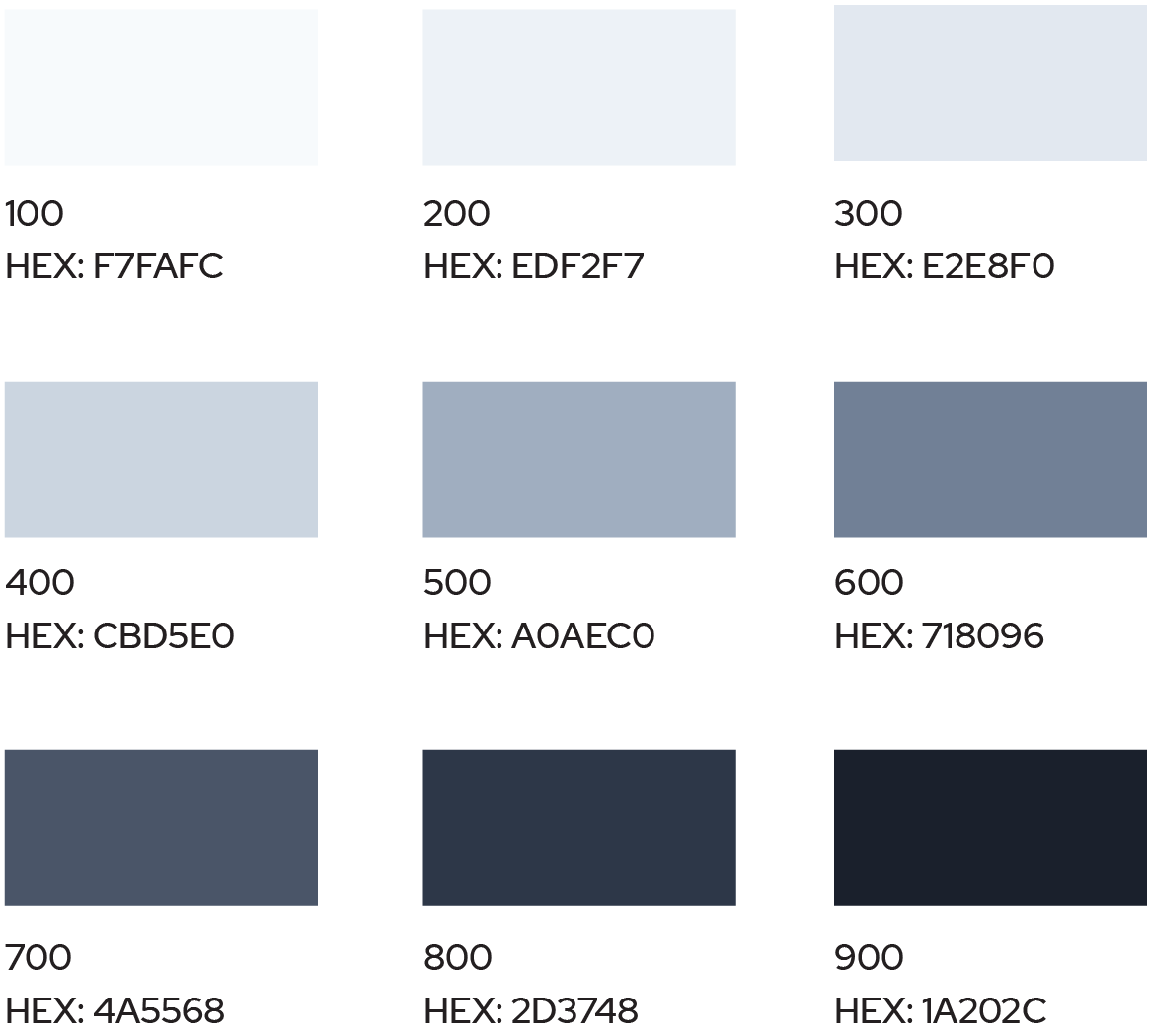
Swatches of Neutral Colors Used
Typography
Primary Font: Red Hat Display is the primary brand font for KEMET properties, and that extends to public-facing websites and apps. It should be used for page titles, headlines, body copy, and any other high-visibility text elements within a page.
Font Styles
Headings should be bold, and body copy should be regular unless part of the content needs to be emphasized. Consider the following best practices when choosing or applying font styles:
- To minimize download time for the user, be sure to use variable fonts when available.
- If you find you are calling out an entire sentence in bold, make sure that sentence would not be better served as a heading or subhead.
- To maintain a professional look, avoid applying multiple styles to the same words within body copy or headings; for example, bold with italic or bold with underline.
- To promote a clean design with good visibility and readability, try to avoid using more than three (3) different font styles, weights, or treatments within one section of a page or application.
Font Colors
The default font color is dark gray (#454545), while white may be used against a darker background color. Primary KEMET Blue or another color may be used occasionally to highlight a specific area, for example in a navigation bar.
Font Color Usage Example
Text Contrast
All text should provide high contrast against its background, to be AA compliant for accessibility as well as for general design cleanliness, visibility and readability.
Text Contrast Example
As mentioned in the building blocks section, Red Hat Display is the primary font for both headings and body copy when creating a public-facing website or app. Since there is no supporting font, you can use weight and size to distinguish between headings and body copy.
We use 0.25rem steps between the h6 and h2 headings. Then for the top-level heading, we jump 0.5rem to distinguish t from the rest of the page visually.
- h1. Largest 2.5rem
- h2. Second largest 2rem
- h3. Medium 1.75rem
- h4. Second smallest 1.5rem
- h5. Smallest 1.25rem
- h6. Body copy heading 1rem
- Body. 1rem or 16px
Note: To give your body copy optimal readability, the best practice is to have a length of 50–75 characters per line, including spaces.
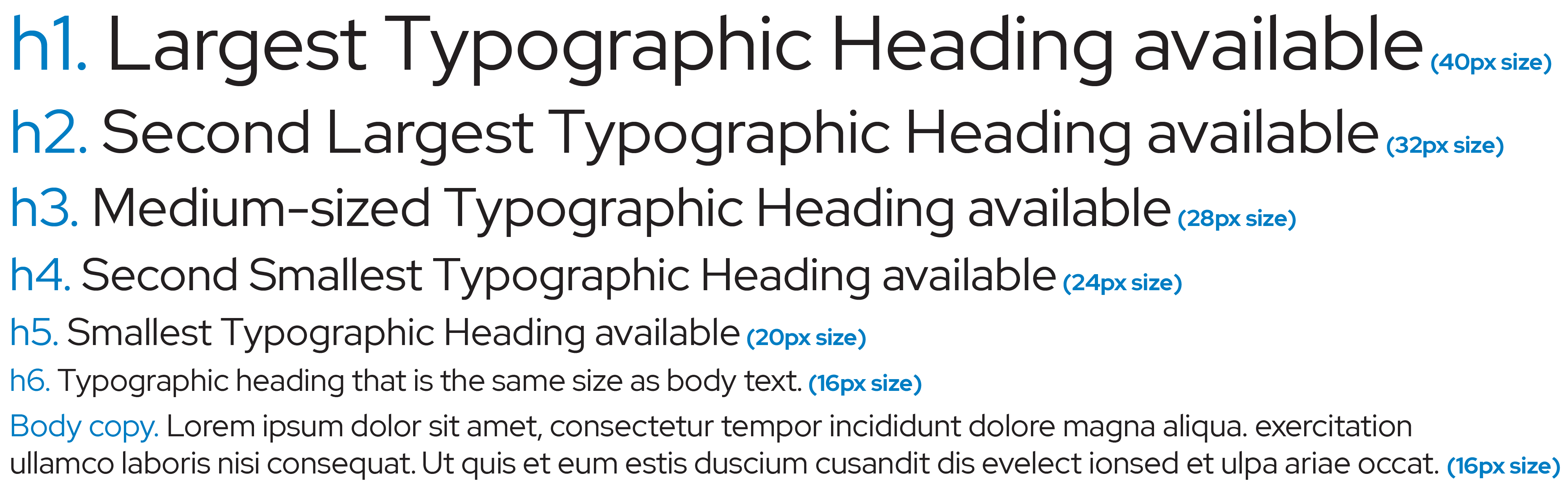
Use font weight and size to distinguish between headings and body copy.
Buttons and Images
Buttons
Buttons are controls that enable users to take action. In addition to being treated consistently from a brand perspective, they should also be user-friendly, which means keeping them identifiable, findable, and clear.
Images
Images should always be of high quality. Make sure the images you use are chosen intentionally to convey or support the specific message or content.
Images should be optimized for the web, including stripping them of metadata at a minimum.
Examples of button styles:
- Button states
- Button neutral
- Button active
- Button with an icon. When an icon is included it is always to the right of the text.
- Button without an icon. Buttons without icons have the text centered.
Secondary buttons
- Outlined button
- Footer button
Note: A button represents an action you will take, while a similar control called a chip represents an action you have taken.
Examples of chips:
- Applied filter in a search
- Filter with an image
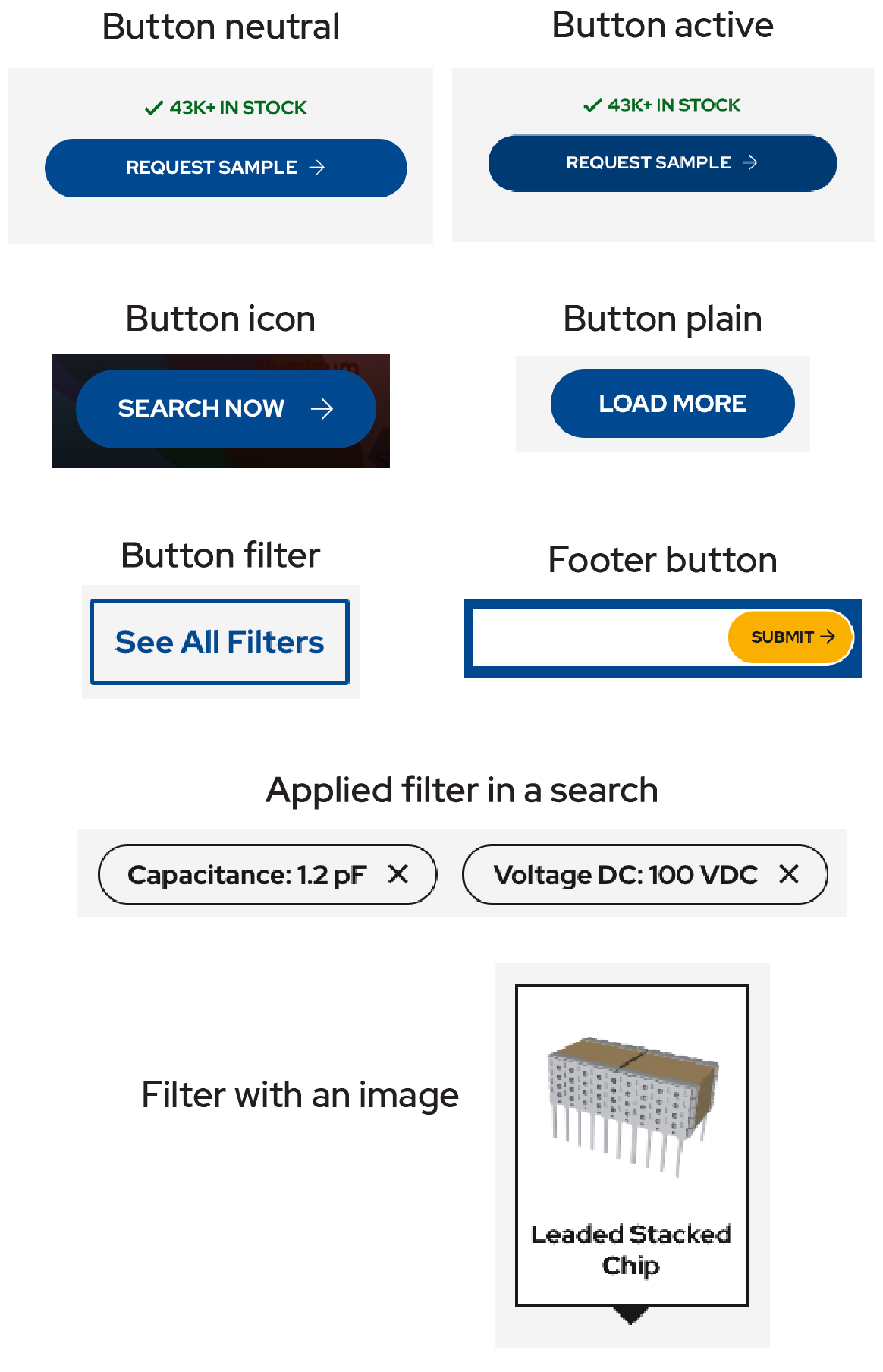
Buttons should also be user-friendly, which means keeping them identifiable, findable, and clear to the user.
Cards
Cards are self-contained pieces that feature content and actions about a single, specific subject. As such, they should always adhere
to these guidelines:
- Contained: Visually and substantively identifiable as a single and contained unit
- Independent: Does not rely on the content surrounding it to provide context
- Individual: Does not merge with another card or divide into multiple cards
For consistency and clarity, consider the following anatomical elements of cards when designing them:
- Container (required): This is the only required element, as a card must be contained and individual. It should have a border, shadow, or both to separate it from the rest of the content. For consistency and to support its function as a card, use rounded corners. Card containers should also be consistent in look across a theme.
- Media (optional): This can include graphics, photos or icons, most often used to draw the eye into the card visually. Media should be high quality and appear crisp, clean, and professional (no pixelation or other visual distractions).
- Supporting Text (recommended): This can be a description or other data to help convey the content of the interface.
- Supplemental Actions (optional): These indicate the path forward in a clear way. If there is no action listed but an action can be taken, make sure there is a clear state change to indicate that the card itself is the primary action.
- Overflow Actions (optional): If there are more than two actions, try showing the integral ones and keeping the rest behind a control (an icon that allows the user to click to reveal more options).
- Header Text (optional): This introduces the contents of the card in a clear way.
- Secondary Text (optional): This provides supporting context for the header.
- Controls (optional, use sparingly): These can be included inside of a card like form elements.
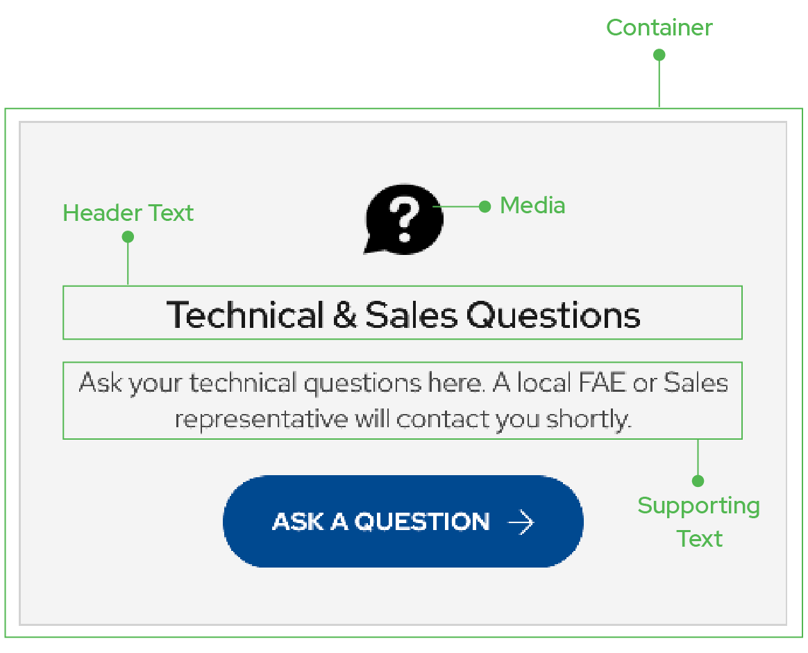
Card Anatomy
Navigation
Navigation provides an easily accessible and user-friendly way to jump between pages and sections without having to scroll through content. This includes the top-level navigation, which spans the length of the top of the page and is visually separated from the rest of the content. There may also be a sub-navigation, sometimes referred to as local navigation, which is found within the content and allows the user to jump around within that page.
- The main navigation should only ever be used at the top of the page, as that is the universally accepted location. Every page in a website should have one, and only one, main navigation. Web applications have to have either a main navigation or, if the main navigation is hidden, a way to travel back to a page that has the main navigation. To avoid causing users unnecessary anxiety, try to avoid hiding the main navigation except sparingly.

Main Navigation
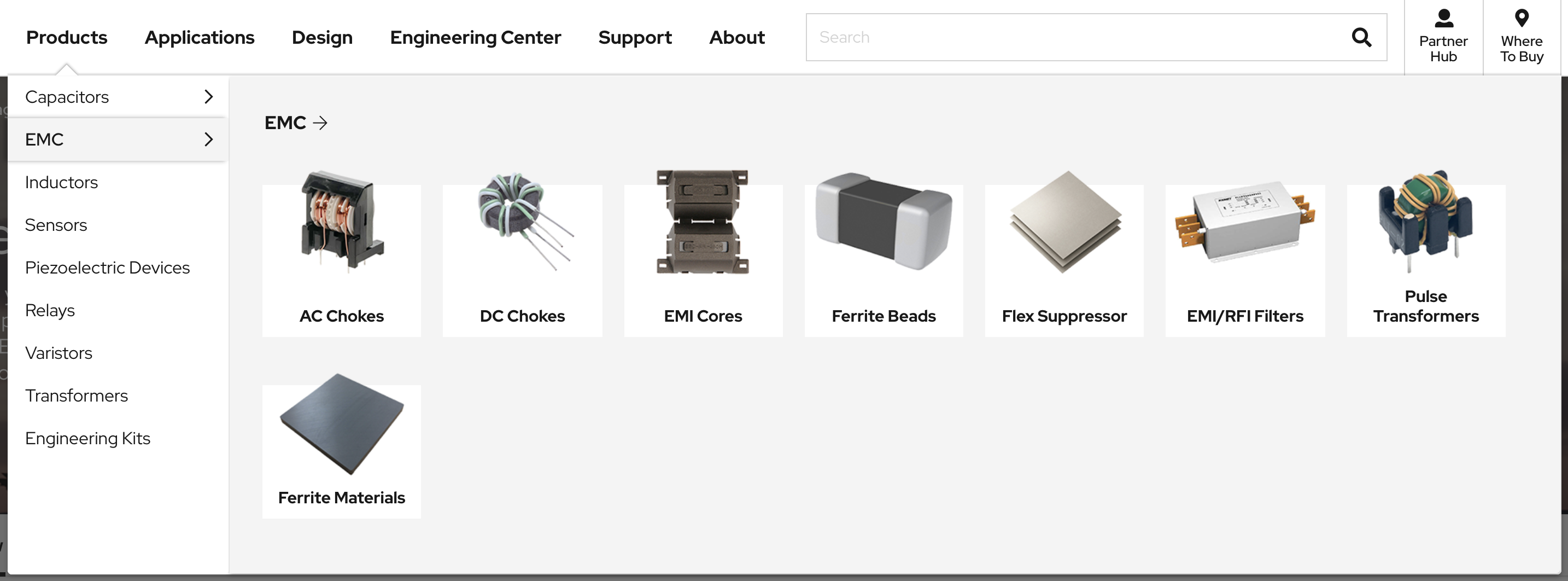
Main Navigation with Drop Down featuring Cards
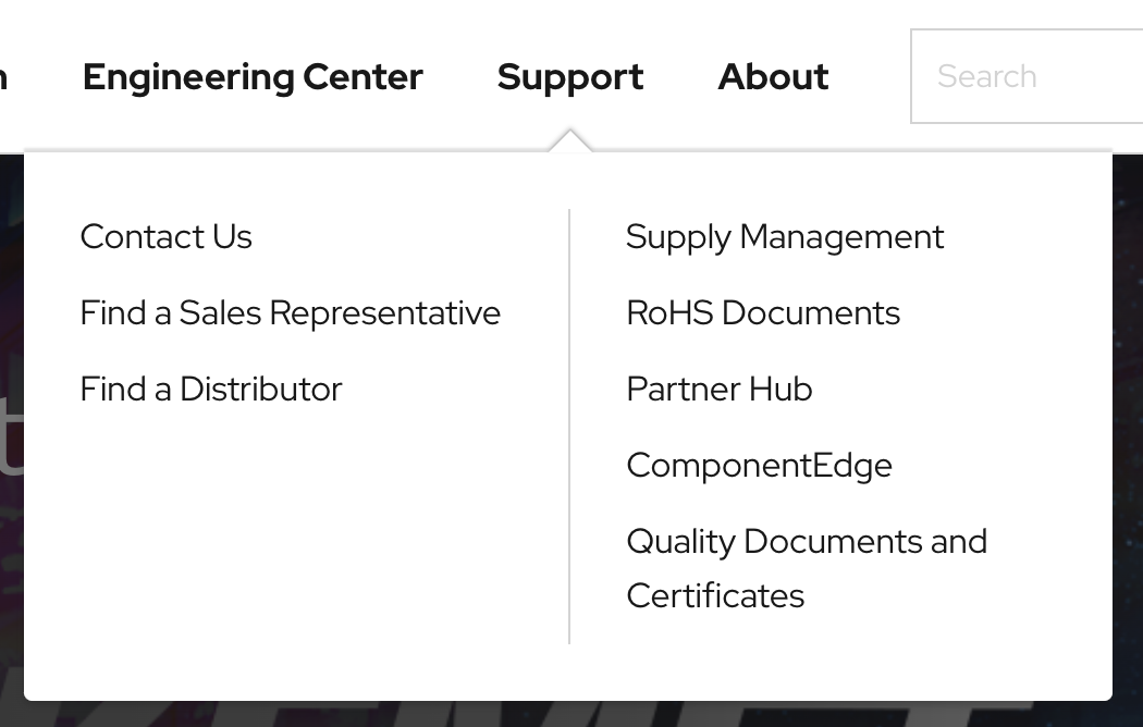
Main Navigation with Drop Down
- A sub-navigation should be used if the page content is too long to expect a user to scroll through every time. If a returning user is looking for content near the end of the page, the sub-navigation provides a means to jump to that content without scrolling.

Secondary Navigation
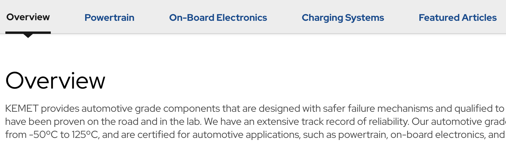
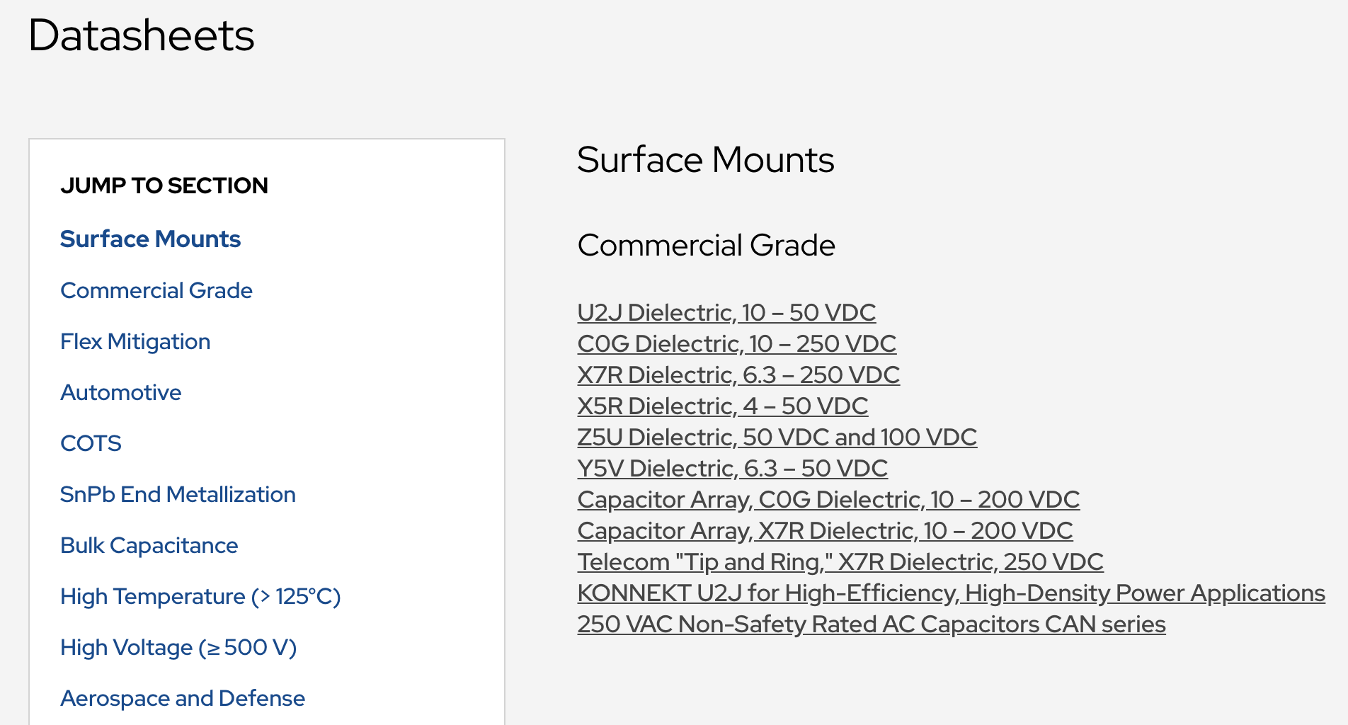
Note: Although “scroll-jacking” (taking over scrolling from a user with code) is generally frowned upon, it can offer much faster and more precise scrolling than a normal user can manage. This type of scrolling is featured on the tertiary navigation found on any Datasheet page.
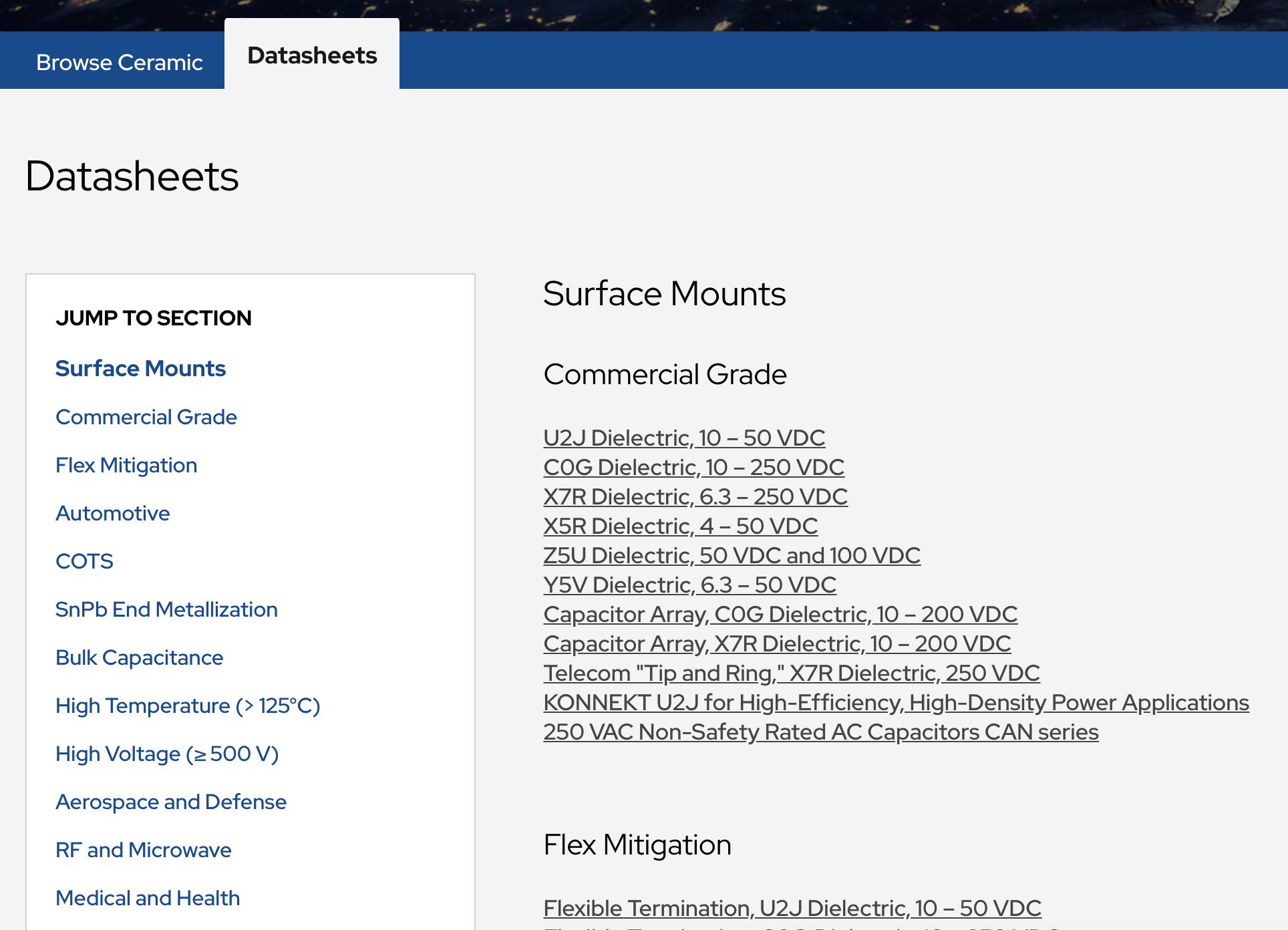
Tertiary Navigation
Logo
Make sure you are promoting brand consistency by maintaining the integrity of the KEMET logo on the web. Use the SVG version of the logo, as it is crisper and lighter on bytes than its counterpart formats.
- Use the logo inside the main navigation only. Any other use should be strategic and necessary.
Logo in the main navigation
- Never align the logo within content, unless it is used inside a card or as part of a larger collection of logos (“logo soup”).
Logo in a card
When using the logo on the web, be sure to adhere to all other brand guidelines as well.
Data Tables
Tabular data displays information across rows and columns. We use data tables to display data-heavy information that cannot be displayed more simply. Tables can typically be avoided by “thinking outside the database” and presenting information in a more interesting format than “field: value.”
Information in a data table should be easily scannable, so try to avoid having too many columns. Table headings should be de-emphasized to draw attention to the data itself. The data table’s borders should be lightened and text left-aligned. These are just a few ways to help focus the user’s attention on the right area.
- You can use tabular data when the dataset is too large or complex to lay out by thinking outside the database, or if a data list is not appropriate. Typically, you will have dense data that needs to be displayed so the user can make a selection or manage the data.
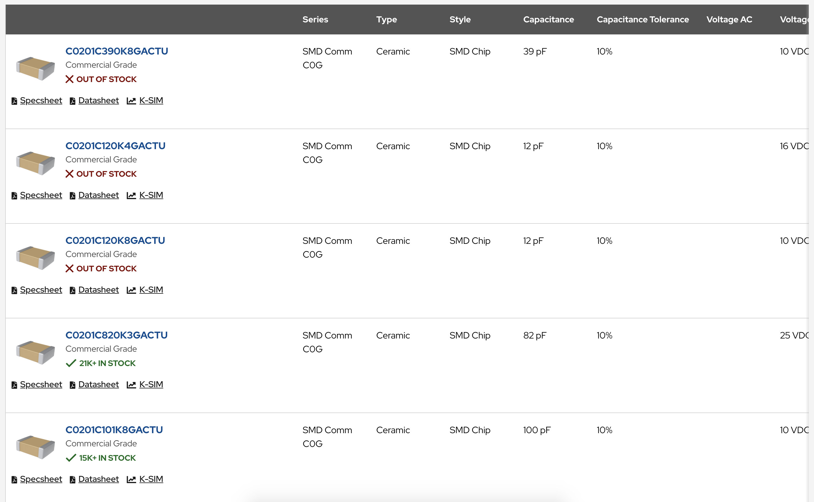
Data Table Example
Layout
Laying out content in a design is about the rational organization of complex data. When you lay things out, be aware of reading direction, emphasis, and scannability.
- Text directionality is left-to-right in the West, but it may be different in other parts of the world. So be aware of the directionality of the text you’re working with when localizing content.
- Another important concept when laying out is emphasis. In a web application, a page should only ever have one primary call to action; that action should support the main purpose of the page. All other actions are secondary, and should be de-emphasized comparatively. This keeps the user’s attention focused on the intent of the page and minimizes confusion.
- Scannability is the combined effect of writing and formatting to compensate for the fact that people don’t fully read content on the web. Rewriting content in an easy-to-scan, concise and objective (rather than promotional) style can greatly improve usability and engagement, so remember to think of scannability when designing for the web.
Organizing content rationally can be accomplished in a variety of ways.
Here are a few considerations to keep in mind during layout building:
- Think about how a banner will look not only on a desktop device, but also on mobile. The best practice is to create mobile-specific banners. For SEO and modularity purposes, use text overlays instead of embedding text on images. Finally, compress file sizes to 40K or below for optimal page load.
- Avoid having too many calls to action on a web page, as this can cause issues with engagement. Think through the most important calls to action that will drive behavior and results, and emphasize those. Other calls to action can be de-emphasized appropriately.
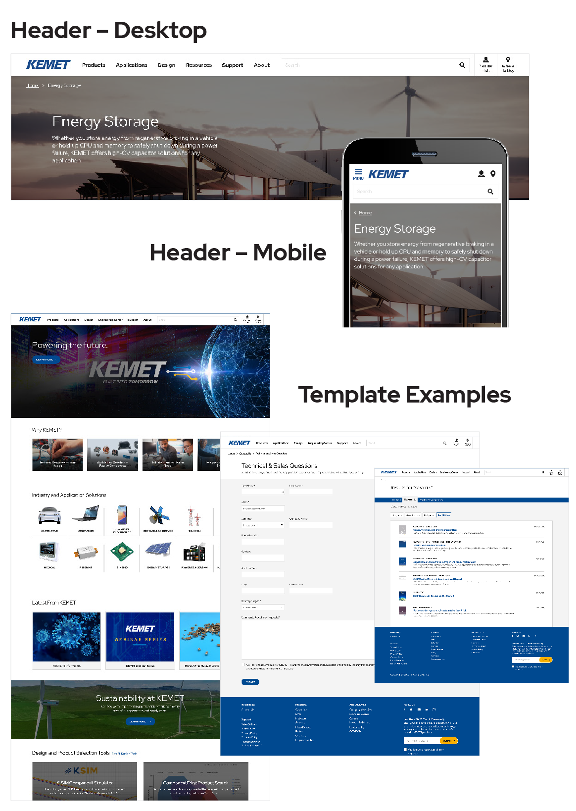
Examples of different layouts
General Best Practices and Reminders
This section provides helpful reminders and best practices to keep in mind when designing KEMET digital assets. Be sure to check back, as these guidelines will continue to be updated based on future issues and learnings.
- When writing or editing content, default to using language designed to be accessible to college-level readers.
- To mitigate potential issues with font downloads for some users, use the system font stack as a fallback to Google fonts.
- Be generous with internal linking, as it can help improve SEO rankings by building a presence as an authoritative source.
- If a new page or application is closely related to another that is already designed and approved, try to make the new design consistent with and complementary to the existing one.
- Do not be afraid to incorporate padding and white space into designs, as it will help keep pages clean and comfortable to view and read.
- Remember to keep the intended end user result (action) in mind when designing new pages or applications.
- Do a fresh review of any new design from the user’s point of view to make sure content and visuals follow a logical flow and contribute to the overall goal of the page.